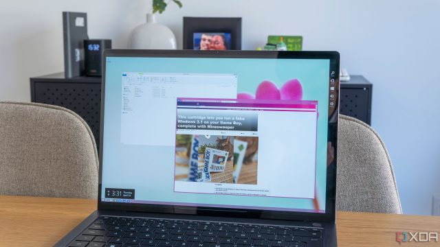
Windows 8 is kind of the laughing stock among the many Windows versions released throughout the years. There have always been misfires, but Windows 8’s radically different approach to the UI design and user experience resulted in one of the biggest failures the company has ever seen when it comes to its big software launches.
It’s easy to point and laugh at Windows 8, but when you try to see through that noise, this operating system actually brought some incredibly welcome changes and features that often get overlooked. We’re all so distracted making fun of it that it’s easy to forget all the great things it brought to the table. I know we take some of these for granted today, but it’s good to remember there was a time not that long ago when things were quite different — and for the worse.
5
Managing startup tasks in Task Manager
It wasn’t always this easy
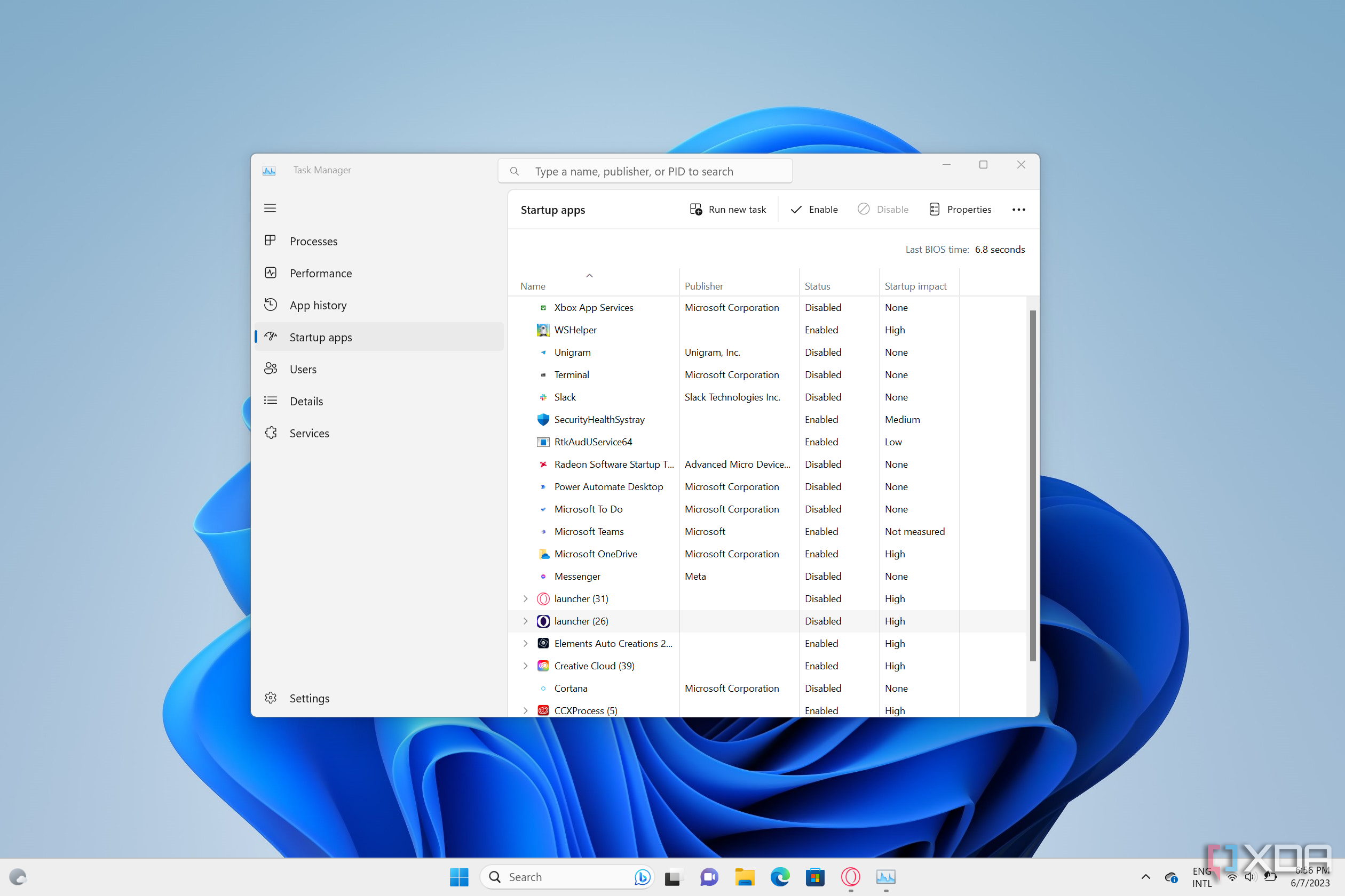
I only learned about managing startup tasks during the Windows 10 era, and this is undoubtedly because this capability used to be a lot more hidden than it is today. Windows 8 introduced the Startup tab in Task Manager, where you can see and manage the list of apps that start with your PC. A lot of apps try to do this and end up using resources when you don’t need them, so it’s good to be able to manage these entries easily.
Prior to Windows 8, startup entries were managed through a tool called System Configuration, which you would also use for entering Safe Mode, for example. It was aimed more so at proficient users than the average Joe, but Windows 8 changed that and made things way simpler. It feels like it should have been this way all along.
Related
How to turn off startup tasks in Windows 11
Is your computer taking too long to boot and feeling slow? You can turn off startup tasks in Windows 11 to help your PC run a bit faster.
4
The File Explorer Ribbon
You could actually do things now
The menu bar in File Explorer prior to Windows 8 was pretty useless, if you ask me. Around 2012, Microsoft was going all-in on this “Ribbon” UI paradigm, which appeared in Office 2013 and, of course, in Windows 8. It’s easy to forget, but Windows 8 introduced the Ribbon UI in File Explorer, and this new UI made a ton of options available with just a couple of clicks.
Sure, the Ribbon takes up a decent chunk of the screen, but all the actions you could want become readily accessible. Copying and moving files, deleting them to the Recycle Bin or permanently, changing selection modes, even enabling the option to view hidden files. It was all easier than ever thanks to this new UI, and Microsoft kept it throughout the Windows 10 generation, too, plus it’s still being used in Office. Windows 11 did go back to a simpler menu bar, but a lot more of those options are available in this new menu now, whereas old versions were way more limited.
Related
I use these 5 File Explorer add-ons to make my life a lot easier on Windows 11
Some File Explorer add-ons can make a difference to improve your workflow on Windows 11. Here are the ones that work for me.
3
Internet Explorer 10 and 11
These were actually good
We’re all used to making fun of Internet Explorer because Microsoft really rested on its laurels after it cornered the market in the late 90s and early 2000s. From Internet Explorer 6 onwards, it felt like the browser was totally stagnant in the face of Firefox and Google Chrome, but if you were paying attention, Windows 8 actually improved a lot.
The original Windows 8 release brought us Internet Explorer 10, with improved support for things like HTML5, CSS3, and hardware acceleration providing significantly better performance. It was made even better with Internet Explorer 11, debuting with Windows 8.1, which improved support for high-DPI screens, added WebGL support, and more, all while performing quite well. I remember around this time I actually switched to Internet Explorer and I really enjoyed using it. It was a shame no one cared, because Microsoft did put a lot of effort into making this a solid browser, but the stigma of IE was just too ingrained in the public mind for it to make a difference.
It’s also worth noting that Internet Explorer became the most touch-friendly browser on Windows at this time, at least for a while, thanks to the dedicated Metro interface it offered. Out of the main players, only Firefox really planned a similar kind of UI, though I recall it ended up never materializing properly.
Related
Internet Explorer is dead – A look back at Microsoft’s browser history
Today is the end of the line that Microsoft has detailed for its Internet Explorer browser, so we’re taking a look back at its history.
2
OneDrive files on demand
The way it should be
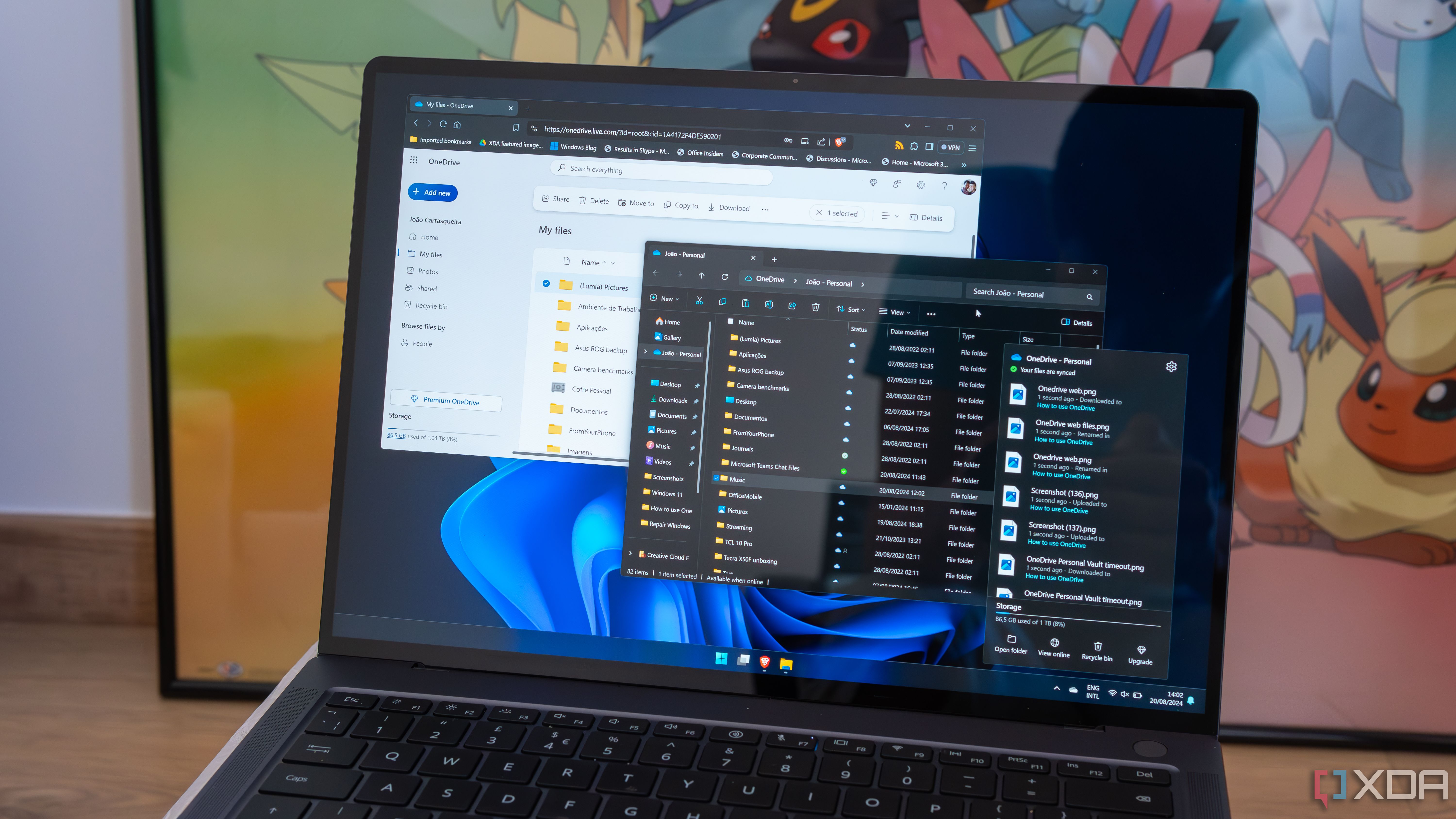
Today, we take the OneDrive integration in Windows for granted, but things weren’t always as natural as they are now. Before Windows 8, while you can download a OneDrive client and have it integrate with File Explorer, you would have to download the files to your PC to have them be visible. Windows 8 introduced a new idea where OneDrive would make all your cloud files visible directly in File Explorer, and you could choose whether to store them locally or not. By default, files were only downloaded if you tried to open them.
This made absolutely perfect sense, and thankfully it’s still the implementation used today. But for a while, it seemed like Microsoft didn’t realize how good of a solution it had created, because Windows 10 initially went back to the idea that if you wanted to see your OneDrive files in File Explorer, you had to download them. It took a lot of user outrage for Microsoft to fix things, and thankfully, it’s been smooth sailing from there. Even macOS supports this kind of implementation with OneDrive now, and it’s so cool to see.
Related
How to use Files On-Demand in OneDrive to save storage space on your PC
You can access files on Windows 11 by saving drive space using this OneDrive feature.
1
An actually good touch experience
Can you imagine that?
Windows 8 was lambasted for its strict focus on touch-based devices like the Surface RT and Surface Pro that launched alongside it. And yes, for traditional desktop users, this new UI was a terrible idea, but Microsoft had a vision for the market it wanted to conquer, and Windows 8 was a stellar adaptation of Windows to a tablet form factor. In fact, all these years later, neither Windows 10 nor 11 have ever managed to provide a touch experience that is anywhere near as satisfying to use as Windows 8 was.
That Start menu with tiles was fantastic for tablets, and the animations all flowed perfectly to make the experience as pleasant as possible. The Charms bar may have been a waste of time on desktop, but it felt so right with a tablet. Opening the task switcher, scrolling through the Start menu, it all made so much sense. And in addition to dedicated Metro apps, some desktop apps like Internet Explorer and OneDrive had Metro versions that were built for touch from the ground up.
Windows 10 kept titles in the Start menu and a full-screen Start interface, but it never implemented touch gestures that felt natural and intuitive. Opening the Start menu still required tapping the button instead of having a swipe gesture, animations for things like the Action center felt delayed, and the gesture for opening task view just didn’t make much sense visually in relation to the gesture you perform. Meanwhile, Windows 11 has gradually added a lot of touch gestures that make a bit more sense, but a lot of the UI still doesn’t feel made for touchscreens, from the Start menu itself to File Explorer. No matter what, it feels like the thought process isn’t “how can we make a great experience for touch users?”, but rather “how can we make this desktop UI work with touch?”. It makes a big difference.
Related
20 touchpad gestures you should be using on your Windows 11 laptop
Can’t find your mouse? Use these 20 touchpad gestures to boost your productivity on your Windows 11 laptop.
Windows 8 was better than you think
I enjoy making fun of bad Windows versions as much as anyone else, but the truth of the matter is Windows 8 was good in many ways. It wasn’t made for desktop PCs and Microsoft made a huge mistake by completely ignoring them, yes, but the course correction we’ve seen since then has also made Windows far worse in many ways, especially on the flagship Surface devices Microsoft tries to sell.
And even aside from the touch interface, it’s important to remember how Windows 8 brought many improvements that we take for granted today. I’m not afraid to say that Windows 8 deserved a better fate than it got, but hopefully we can still give it the credit it deserves today.
Related
Was Windows Vista really as awful as we remember?
The answer may surprise you


