Microsoft is no stranger to make weird and sometimes simply bad decisions when it comes to Windows. Not every change the company has made has been welcomed by fans, and in some cases, the backlash has been so strong that the company was forced to quickly reverse those choices.
There have been many instances of this, especially in the past decade or so, since major updates became more viable over the internet. It’s important to remember that when it comes to things like this, there is strength in numbers, and complaining to Microsoft can result in actual changes being made. So let’s take a look at a few examples where Windows users forced Microsoft to fix bad design choices.
Related
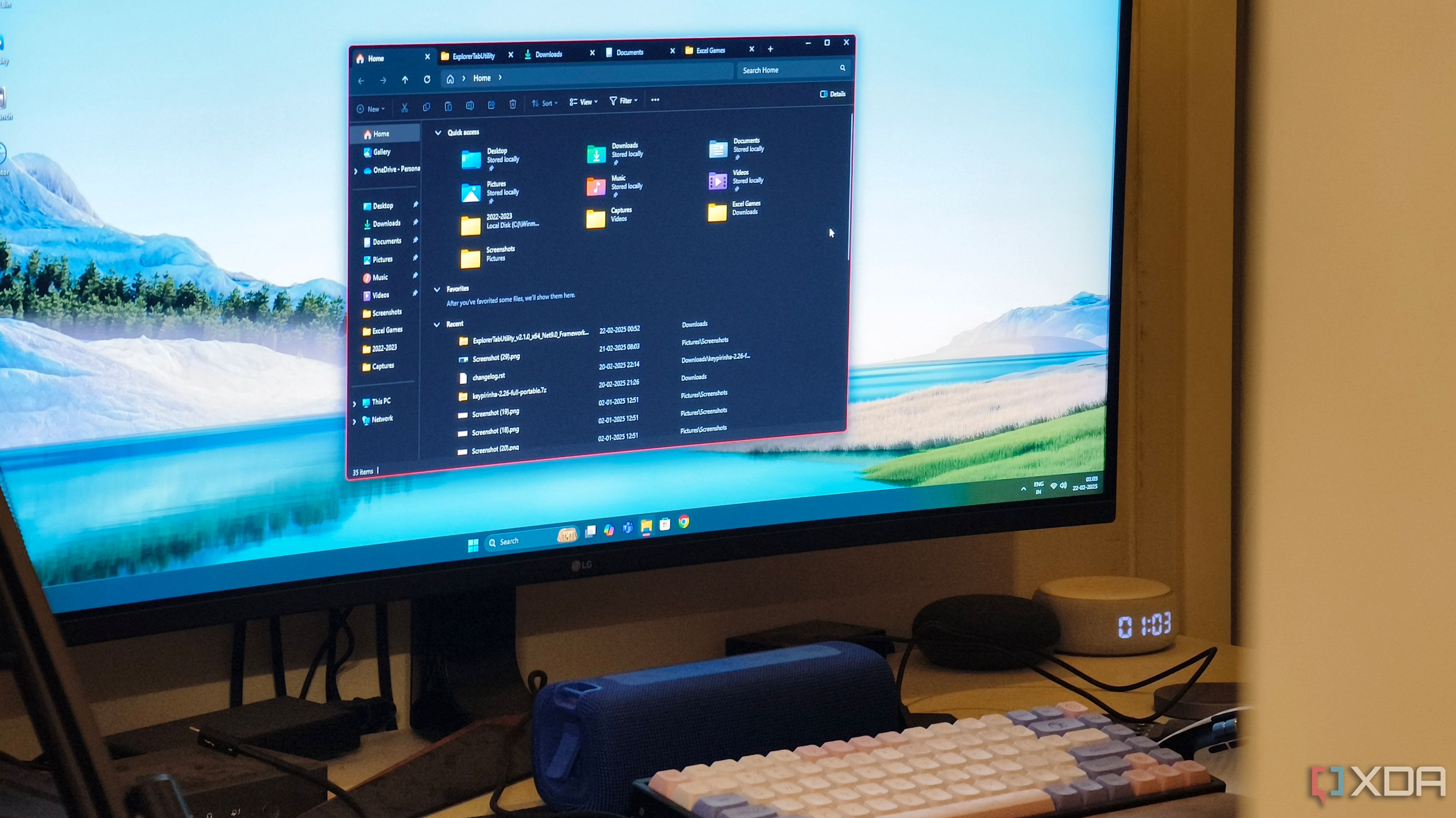
I fixed File Explorer tabs on Windows 11 thanks to this app
Manage files without clutter
6
The Windows 11 taskbar
So limited at first
When Windows 11 first hit the market, it was very surprising that so many features in previous versions of Windows were removed. Some of those still haven’t been fixed, like being able to move or resize the taskbar, but two major elements have been. First, the context menu, or the lack of a useful one. Windows 11 originally shipped with a context menu for the taskbar that featured a single option to change taskbar settings, which removed one of the easiest ways users had to access Task Manager. Due to plenty of criticism, Microsoft eventually added a Task Manager button to the context menu the following year.
Then there’s the fact that Windows 11 completely removed the option to ungroup icons on the taskbar and show labels for each window. Combining icons was already the default behavior since Windows 8, so Microsoft probably figured users would just accept this, but many didn’t, and they were fairly loud about it. This took a while longer to fix, but Microsoft did eventually bring back taskbar ungrouping to Windows 11, so you can make your windows easier to identify at a glance.
Related
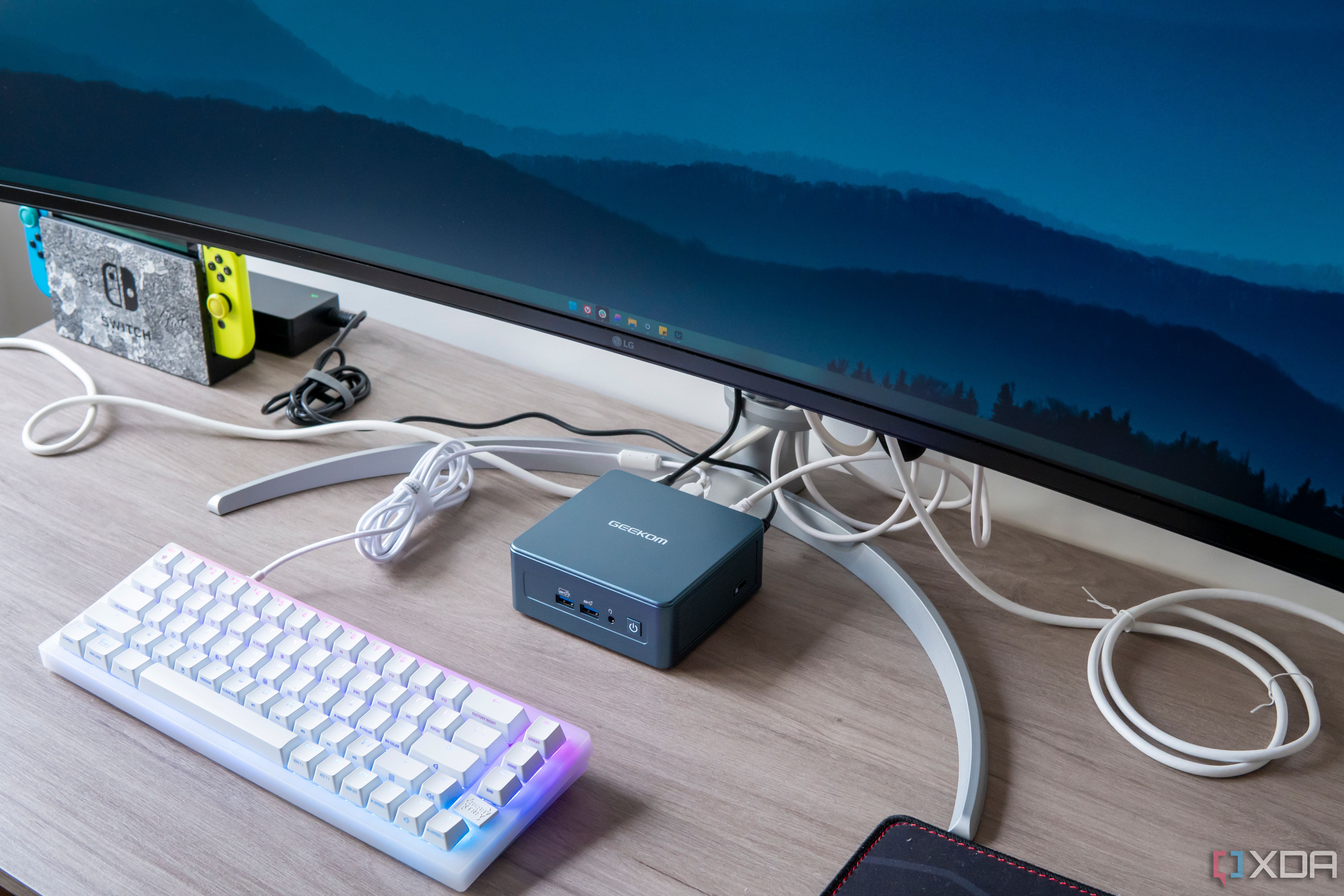
7 ways to customize the Windows taskbar for maximum productivity
The Windows 11 taskbar may seem basic, but there’s a lot you can change about it. Here are a few ways you can boost your productivity.
5
A clock with seconds
I didn’t know this was a big deal
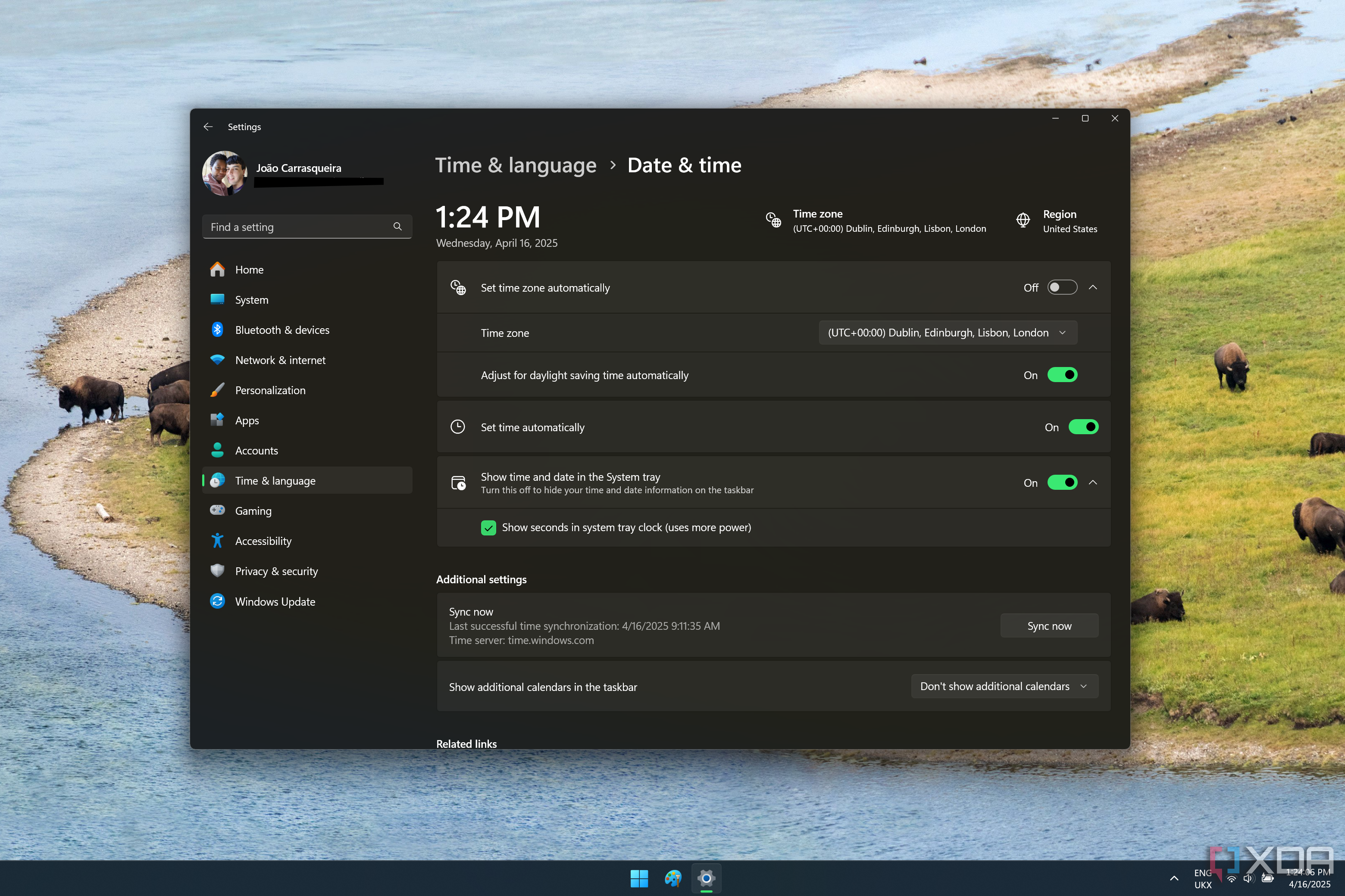
Just because something is heavily requested, it doesn’t mean I really get it, and personally, the ability to see seconds on the clock in the taskbar was one request I never really understood. Regardless, Windows 11 shipped without the ability to see the current time down to the second, something previous versions had done for a long time, and that didn’t sit well with a lot of users.
Microsoft eventually budged and offered a solution by putting the seconds directly on the taskbar as an option, though it warns users about the potential increase in power usage from enabling this feature. In the past, seconds would be shown in the clock flyout so it was a bit different, but still, a solution is a solution.
Related
How to enable the seconds on the Windows 11 clock
Want to keep track of time more accurately? The Windows 11 Moment 3 update makes it easy.
I may be getting ahead of myself here
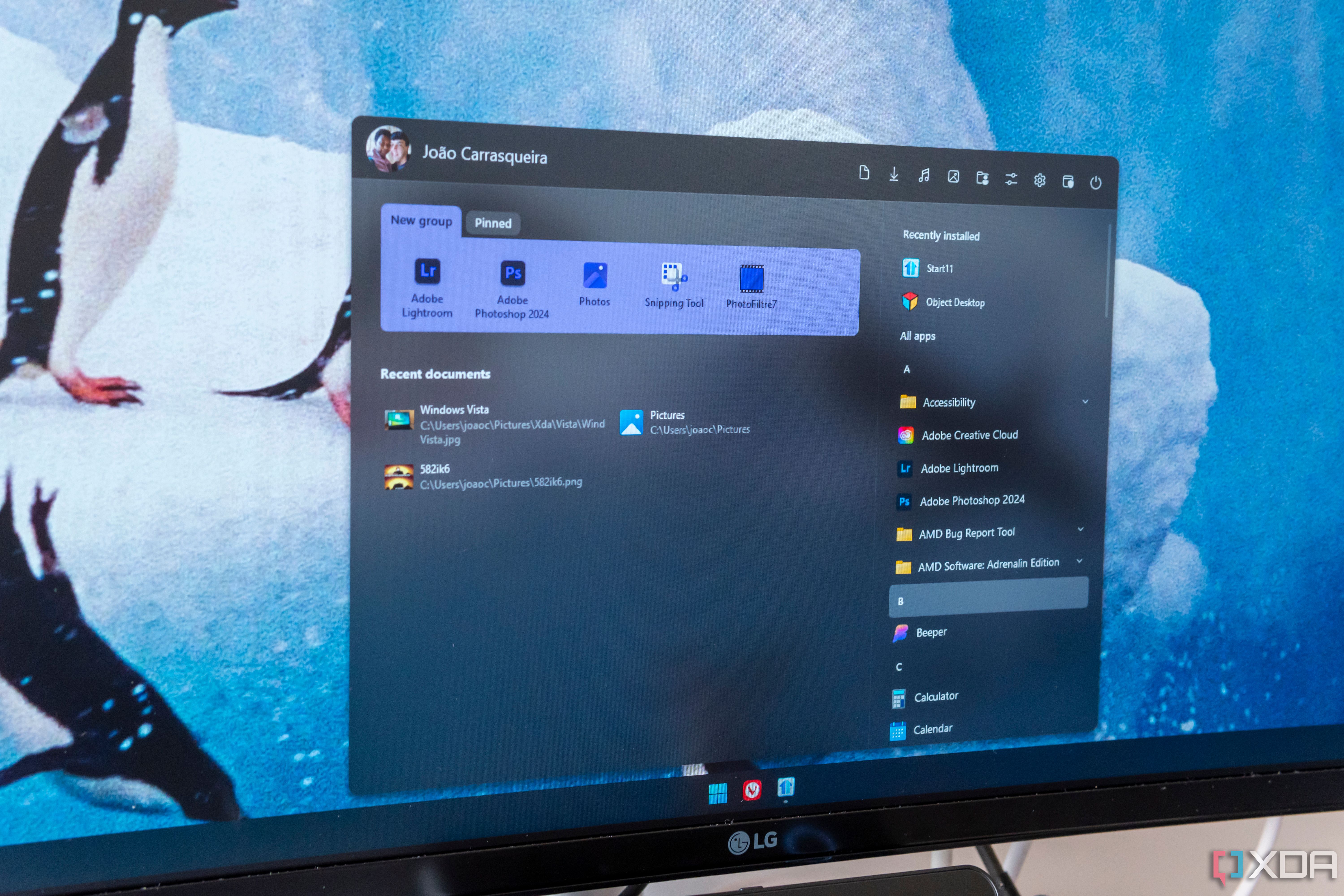
This one is interesting because it’s not yet confirmed that this will happen, but it seems that, after many years, Microsoft is finally fixing the Start menu on Windows 11. From the get-go, many users have been critical of the Windows 11 design for this menu, which is smaller and more restrictive than previous iterations. You can’t remove the Recommended section even if you disable all the content in it, and the All apps list is a wholly separate page that makes it harder to see all your apps quickly.
A new design spotted in recent builds of Windows 11 shows a much larger Start menu with the ability to disable the Recommended section entirely and quick access to your full list of installed apps, which should make it way faster to open the apps you want and need.
Even before that, though, it’s fair to say Microsoft has fixed the Start menu in other ways before. A big one was adding the ability to create folders for your apps, making it easier to have more apps readily accessible in the pinned section. This was something Windows 10 did, but was initially removed in Windows 11, but thankfully it was brought back relatively quickly.
Related
5 Start menu alternatives and Windows tweaks that will speed up your workflow
Revamp your Windows experience with smarter Start menu alternatives and tweaks—boost efficiency, streamline navigation, and work faster
3
OneDrive files on-demand in Windows 10
Removing this was a really bad idea
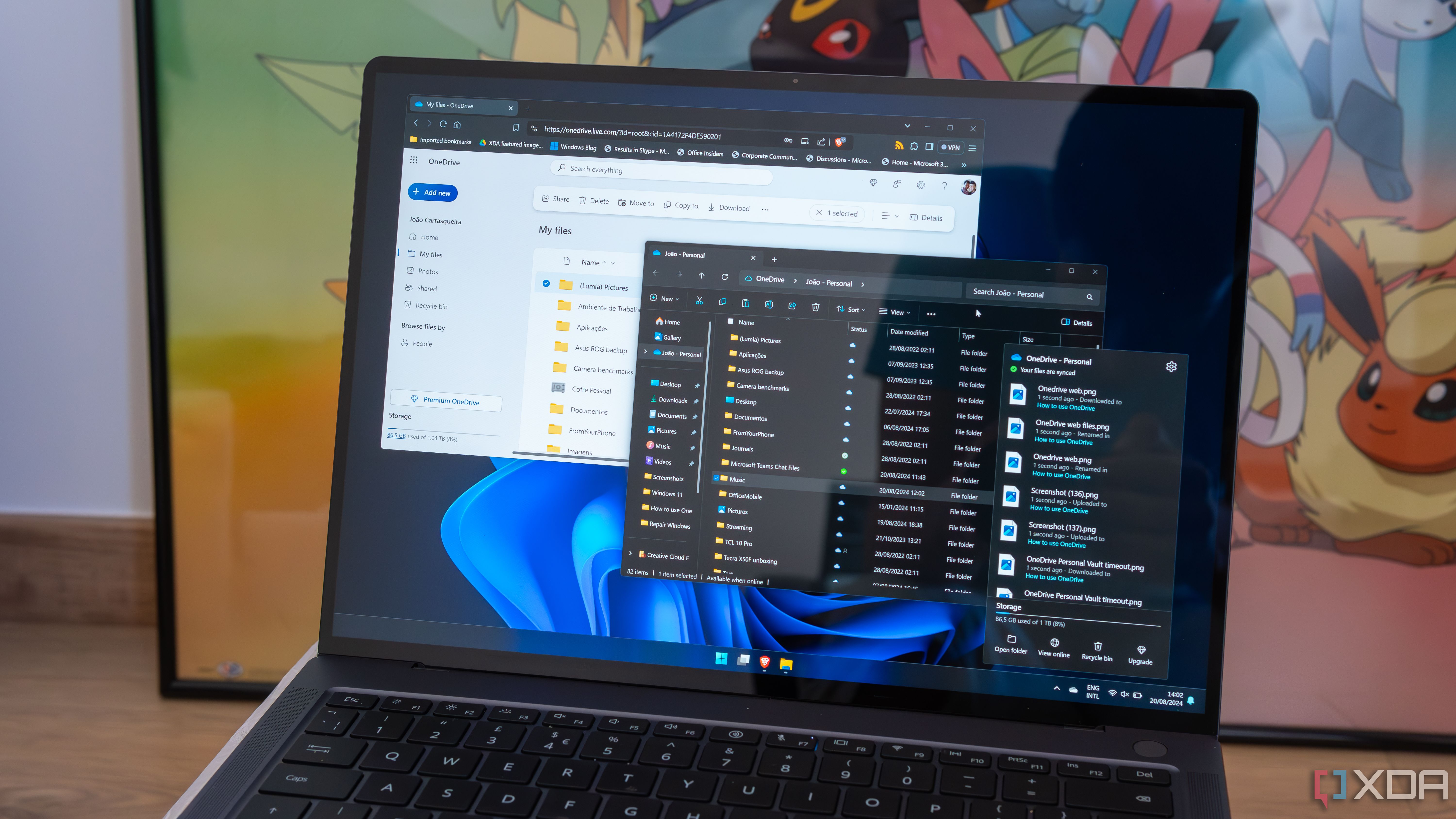
Windows 8 may have done a lot of things wrong, but one of the best things about that operating system was how it integrated with OneDrive for the first time. The OneDrive integration in Windows 8 made it so that you could see your cloud files in File Explorer as if they were stored on your PC, but they would only be downloaded if you opened them or actively downloaded them to your PC — pretty much like how it is today.
But for a brief moment in Windows 10 history, this wasn’t the case. After introducing this fantastic feature in Windows 8, Microsoft removed it from Windows 10, and the OneDrive sync client forced you to sync and download all your files to your PC locally if you wanted to access them through File Explorer. Thankfully, after enough backlash, Microsoft realized this was a huge step back, and the feature was finally re-introduced under the name “Files On-Demand”, and that’s become the default behavior ever since.
Related
How to use Files On-Demand in OneDrive to save storage space on your PC
You can access files on Windows 11 by saving drive space using this OneDrive feature.
2
The Start button and desktop on Windows 8
There was a lot to unpack with this one
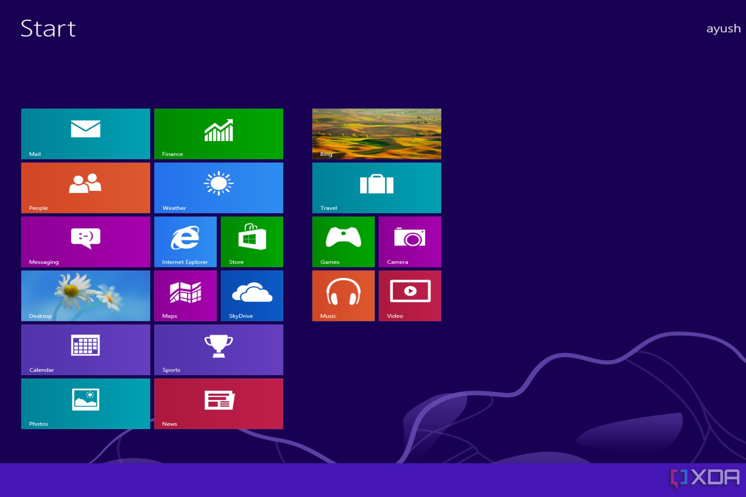
Microsoft may be known for making some bad decisions, but it has to be said that Windows 8 was probably one of the most jarring, confusing, and seemingly random transitions the company has ever done for its big operating system. Moving away from a desktop focus to a completely tablet-oriented UI was certainly a choice, and one that worked out horribly for Microsoft. Windows 8 broke many of the conventions of Windows up until that point, but two of them were particularly egregious.
First, the Start button, or the lack of one. The desktop on Windows 8 doesn’t show a Start button at all, so if you’re not familiar, you don’t really know what you’re supposed to do to open the Start menu (or Start screen, as it was in Windows 8). It was actually in the same approximate position, but you’d have to move the mouse into the very corner of the screen to see a preview of the Start screen, which you could then click to open it. it worked, but it was definitely unintuitive after nearly two decades of the typical Start menu placement.
And then there’s the fact that the desktop was not — and could not be — the default UI when you first turned on your PC. Even if you had a desktop with a keyboard and mouse, Windows 8 would always boot to the Start screen, with its big tiles and very limited apps.
These issues were fixed with Windows 8.1, which restored the Start button and made it possible for desktop PCs to boot straight into the desktop instead of going through the Start screen each time. It may have been too late to save Windows 8, but these alongside many other improvements did make Windows 8.1 a lot better.
Related
Where did Microsoft go wrong with Windows 8?
Windows 8 brought a lot of design changes and new additions to the table. So, why did it end up as one of the most despised Windows operating systems?
1
User Account Control in Windows Vista
It got in the way far too often
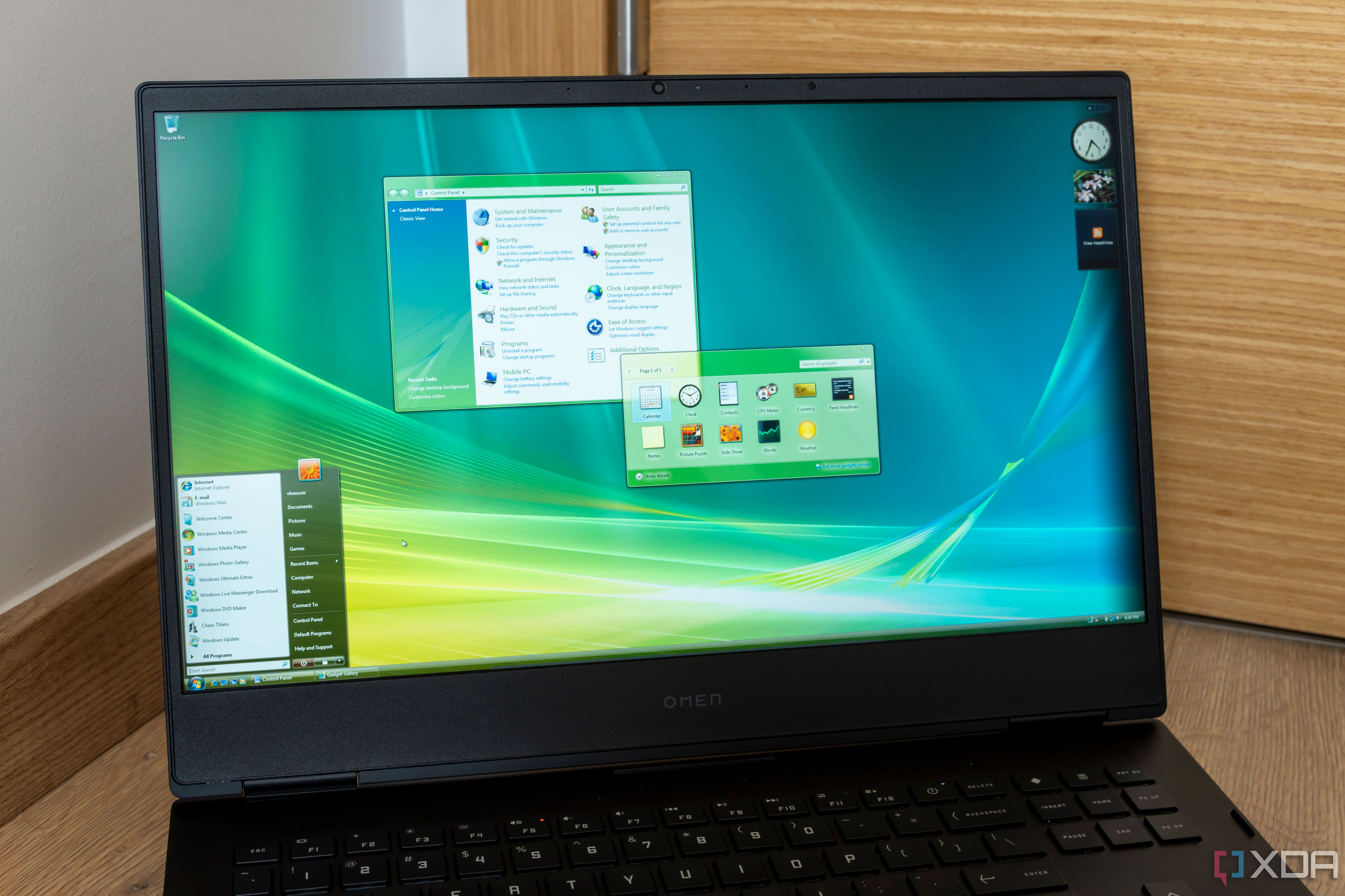
Windows Vista was a big step forward in many ways for Windows, but it also came with a lot of downsides, including performance. Vista also introduced some big security features, and the most notable (for better or worse), was User Account Control (UAC). This changed the approach to permissions in Windows so that a logged-in user wasn’t always assumed to have full rights to make changes without administrator rights. This would prevent apps from modifying the system without explicit administrator permission.
However, while it was meant to be better for security, the UAC implementation in Windows Vista was far too strict, which meant that almost any action users tried to perform on the system would ask for administrator permissions with a prompt, wasting a lot of time when trying to do tasks that should be relatively trivial. The feedback against this was so strong that Microsoft tried to fix it by changing the default UAC behavior to be more liberal with Windows Vista Service Pack 1. It did help somewhat, though it wasn’t perfect, and Microsoft ended up making more refinements with Windows 7 and later versions.
Related
Was Windows Vista really as awful as we remember?
The answer may surprise you
Fans help keep Windows good
These are just a few examples, but this list goes to show that in the end, users and fans play a bigger role in the direction Windows takes than you might think. Sure, Microsoft may push hard in a certain direction, but sometimes, users’ voices can rise above that and force the company to make changes that actually benefit all users in the long run. Hopefully, the company keeps listening to its users and makes better decisions going forward.


