Excel is a powerful spreadsheet toolthat allows you to create charts and visualizations for complex data analysis. Some Excel functions feel like magic. While I mostly use Excel for creating expense and income records, I’ve started exploring some of the software’s more powerful features.
That’s when I stumbled across Quick Analysis, which makes my Excel experience considerably easier. In fact, I would recommend it to anyone who wants to explore the powerful features that Excel offers, especially if they’re just starting out with it.

Related
5 underappreciated reasons why Excel is still the king of spreadsheets
It simply excels at what it does
What is Quick Analysis in Excel?
A handy feature that is easy to miss
The Quick Analysis tool in Excel analyzes your selected data and provides ways you can visualize that data without requiring manual formulas. When you highlight data in a column, a small box with a lightning bolt will pop up — you can click this box to access Quick Analysis options. You can also access Quick Analysis by using the shortcut Ctrl + Q.
Quick Analysis is not limited to a Microsoft 365 subscription; you can find it in the one-time purchase versions of Microsoft Office. For example, I could access the feature in my copy of Excel 2013. However, you will need a subscription if you want to use the tool in conjunction with Copilot (which is one way you can use Copilot in Excel).
I also could not find Quick Analysis when I used Excel for the web, even when linked to my Microsoft 365 account.
What can you do with Quick Analysis?
Charts, tables, and more
Quick Analysis includes tools for formatting cells, as well as creating charts, tables, and sparklines. It also has a Totals tab that gives you access to a number of Excel formulas that are relevant to the selected data.
For example, if I select a column with numbers, I’ll get suggestions for formulas such as Sum, Average, and Running Total. If I select a column with text items, the Totals tab shows the Count option.
By going through the options for each tab, you may even discover new Excel features you weren’t even aware of. For example, sparklines are useful for visualizing data trends. Meanwhile, I uncovered an abundance of formatting options while using the tool, including icons, data bars, and color scales.
Why I suggest Quick Analysis for Excel beginners
It speeds up your learning
While you should research the different functions that Excel offers, this can be time-consuming, especially when you’re on a deadline. However, Quick Analysis gives you access to data visualization tools without you needing to understand all of the functions and features behind them.
For example, when I was trying Python in Excel with no coding experience, I was struggling to get the right DataFrame and Series configurations for the data I wanted to visualize. However, using Quick Analysis, I was easily able to create bar charts that visualized the number of items in a sales table.
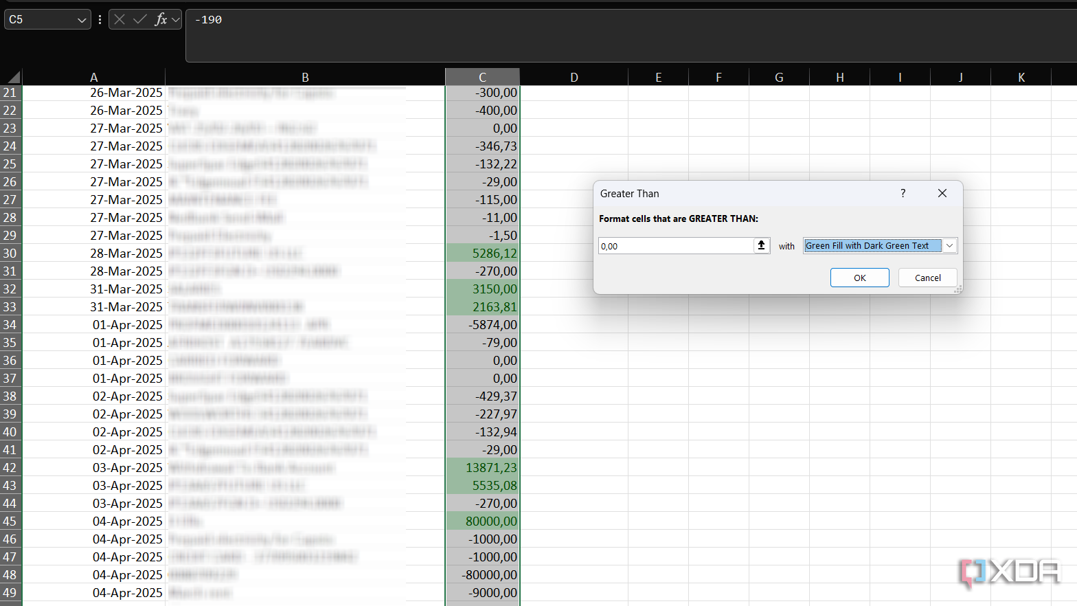
I tried Quick Analysis with some real-world data based on my spending and income for the past month. Using Quick Analysis helped me uncover Excel features that I wasn’t familiar with before. For example, I was able to use Greater Than formatting to highlight all income in my sheet. While Quick Analysis didn’t give me an option for Less Than, my discovery of these formatting functions was facilitated by Quick Analysis.
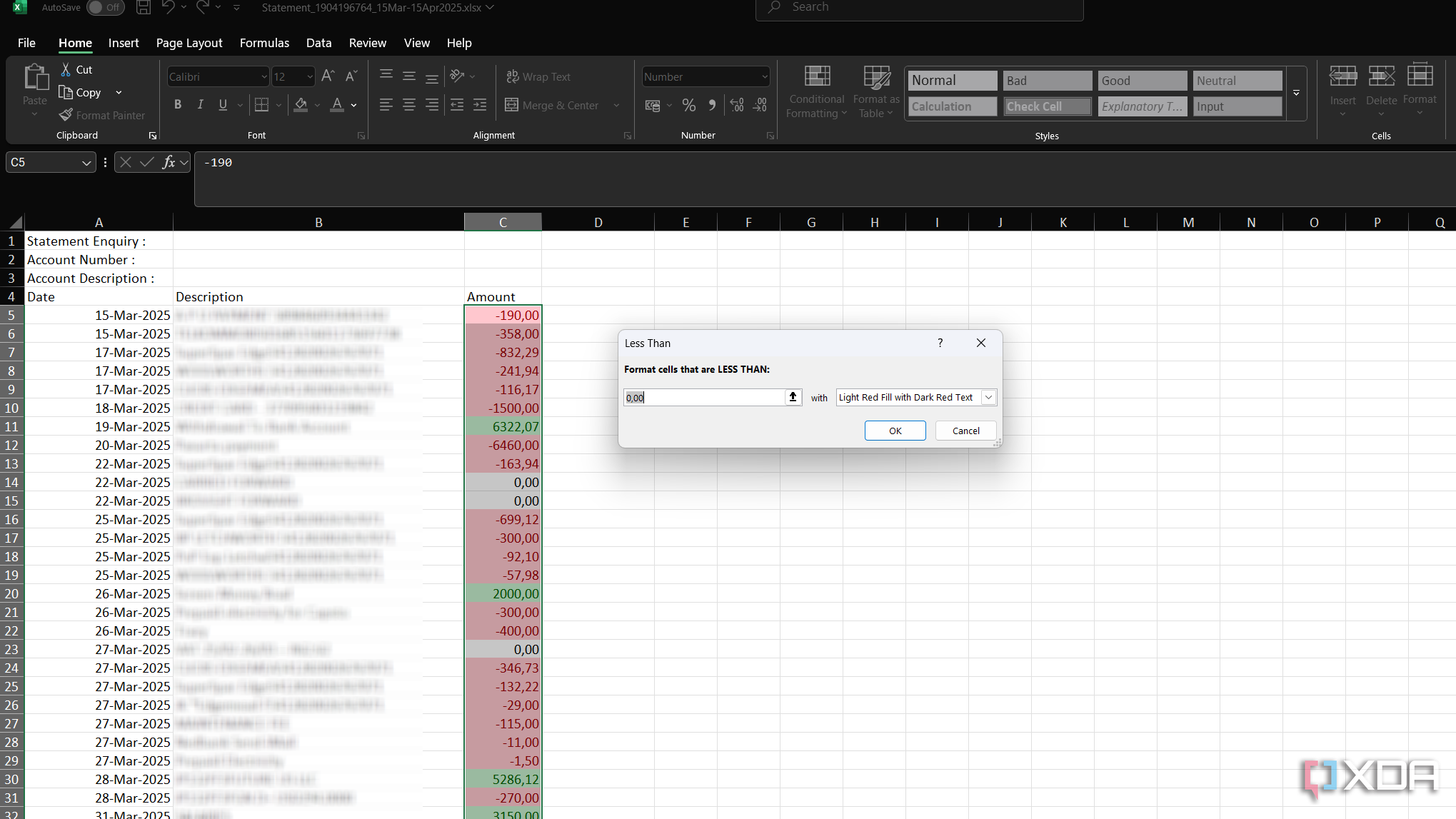
I was then able to explore the formatting options and apply conditional formatting for all items less than a certain amount (e.g., my expenses). With the formatted sheet, I can easily spot my expenses and income through color coding.
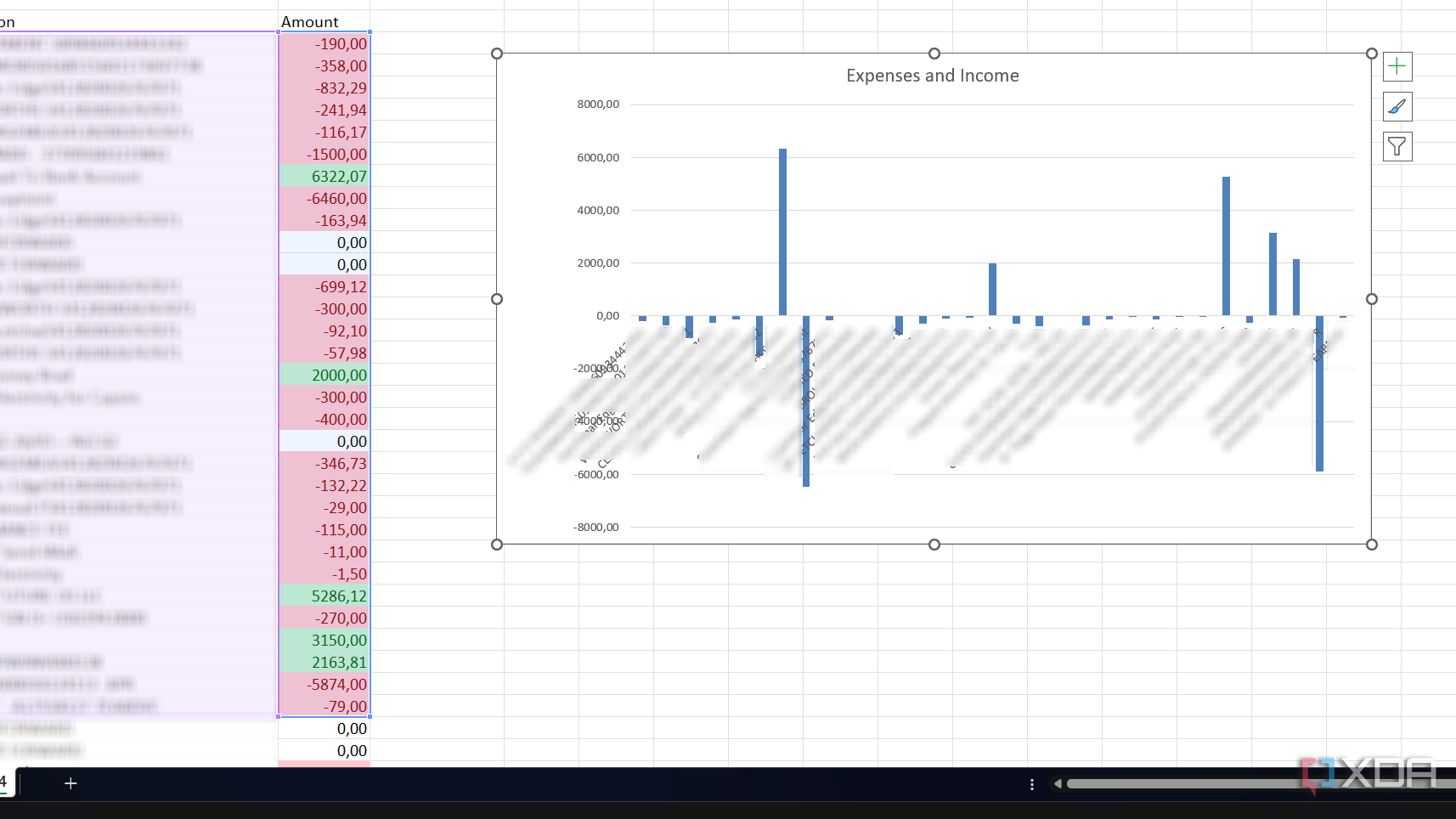
I could also create a clustered column chart showing my income and expenses, with the visualization highlighting my biggest expenses. Since the Quick Analysis tool opens the tab for the relevant feature you’re using (in this case, the Chart Design tab), it becomes incredibly easy to isolate exactly which feature you’re using. You can then tweak the design or explore other features and see how your visualization reacts.
While there are plenty of online videos and tutorials you can use to discover Excel features, Quick Analysis has by far been the most effective tool for me when it comes to learning Excel’s different capabilities.

Related
9 Excel hacks I wish I knew earlier
Excel tricks to save you hours every week
Quick Analysis may be my favorite Excel feature
Before I came across Quick Analysis, I was overwhelmed by the many features Excel offers. I felt like I would have to read dozens of tutorials to figure out the different features the software offers. But using Quick Analysis has greatly sped up my familiarity with Excel while offering a practical way to get experience with the software.
If you’re like me and you’ve only dipped a toe in the different things that Excel can do, then Quick Analysis is a great way to speed up your learning. You can also explore beginner tips for Excel to enhance your experience.


