


Whenever I manage large databases and projects in Excel, Microsoft’s spreadsheet software can sometimes feel intimidating. It often results in an inefficient and frustrating experience. Then, I decided to take control and build my own Excel dashboard. The result was transformative. Suddenly, I had a clear, concise, and visually engaging snapshot of everything I needed to know.
Let me walk you through my step-by-step process for building a dashboard that not only looks great but also provides instant clarity on your data’s key metrics. Whether you’re a seasoned Excel user or just starting out, you’ll be surprised at how easy it is to unlock the potential of your data.

Related
7 quick Excel tips to convert a beginner into a pro
Skyrocket your Excel skills
Why do I use a dashboard for every large project?
Here are several reasons why I use a dashboard for major workbooks in Excel.
- Instead of multiple spreadsheets, I have a central view of the entire project.
- It eliminates the confusion and ensures everyone is looking at the same data.
- With Slicers, I can easily filter everything on the dashboard (more on the later).
- This helps me ensure the project stays on track and within budget.
- I can quickly analyze trends and patterns to optimize resource allocation and project strategy
Prepare your data

Before you can create a beautiful and effective dashboard, you need to ensure your data is clean, organized, and structured for analysis. If you are dealing with raw data, make sure to convert it into tables (Insert > Table). This allows for dynamic updates and easier data manipulation. You should also use descriptive column headers for your tables.
You can use Excel’s formatting tools to standardize date and currency formats, opt for the TEXT function to fix text formatting and explore the Remove Duplicates function (Data > Remote Duplicates) to take care of repetitive values. While you are creating tables, make sure to use Excel functions to add calculated columns.
For example, if you are adding project task data, use Excel functions to calculate the number of days for a task, the overall budget, the remaining budget, and other crucial details for your project.
Build PivotTables and charts
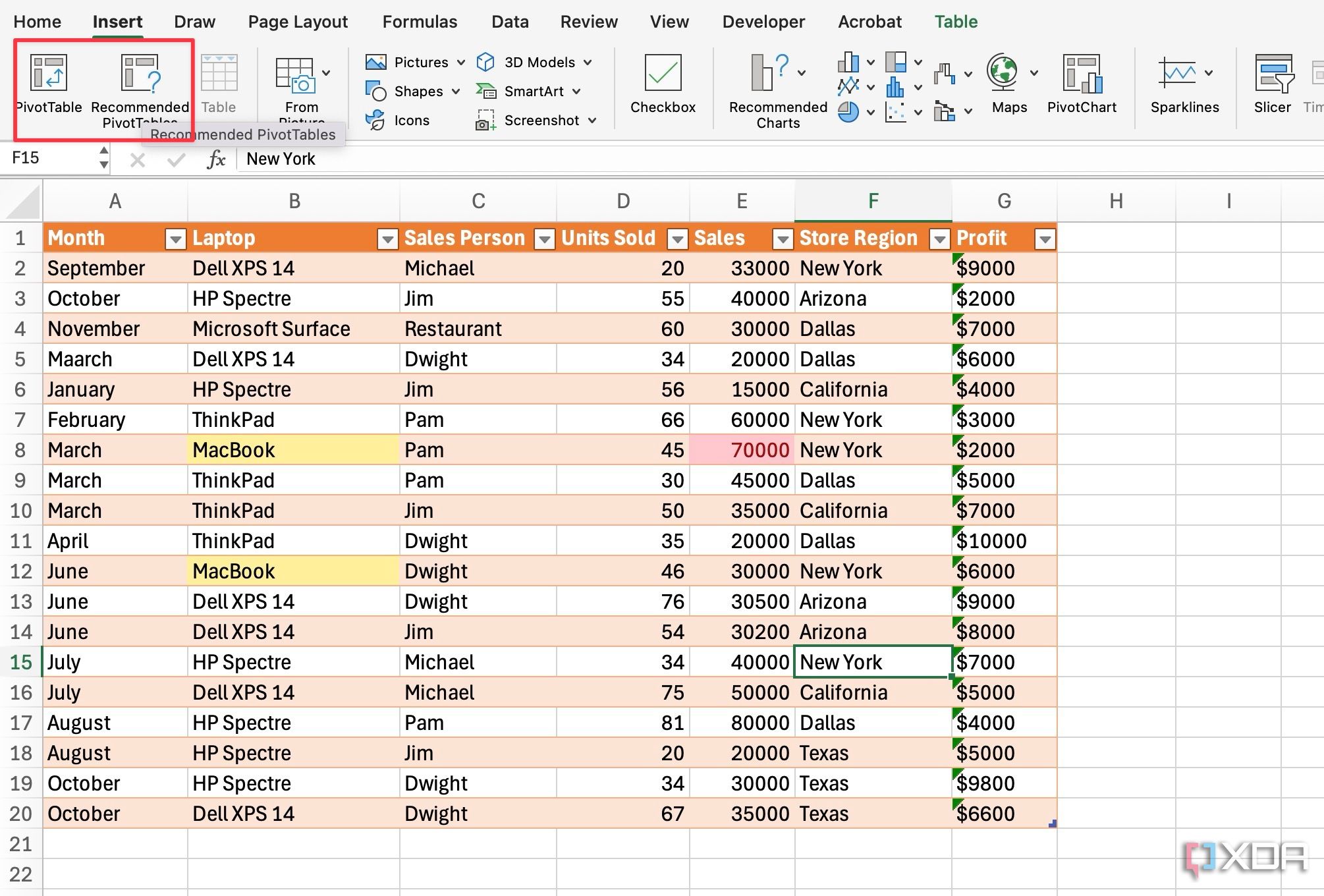
PivotTables excels at quickly summarizing large datasets. They allow you to extract meaningful insights by organizing data based on various criteria. In the example below, I have sales data from several employees from different regions. Now, I want to see how many units have been sold in a specific month and how much profit each salesperson has generated.
-
Open your Excel database and head to Insert > Recommended PivotTables. You can also create a PivotTable manually from the Insert > Tables > PivotTable
-
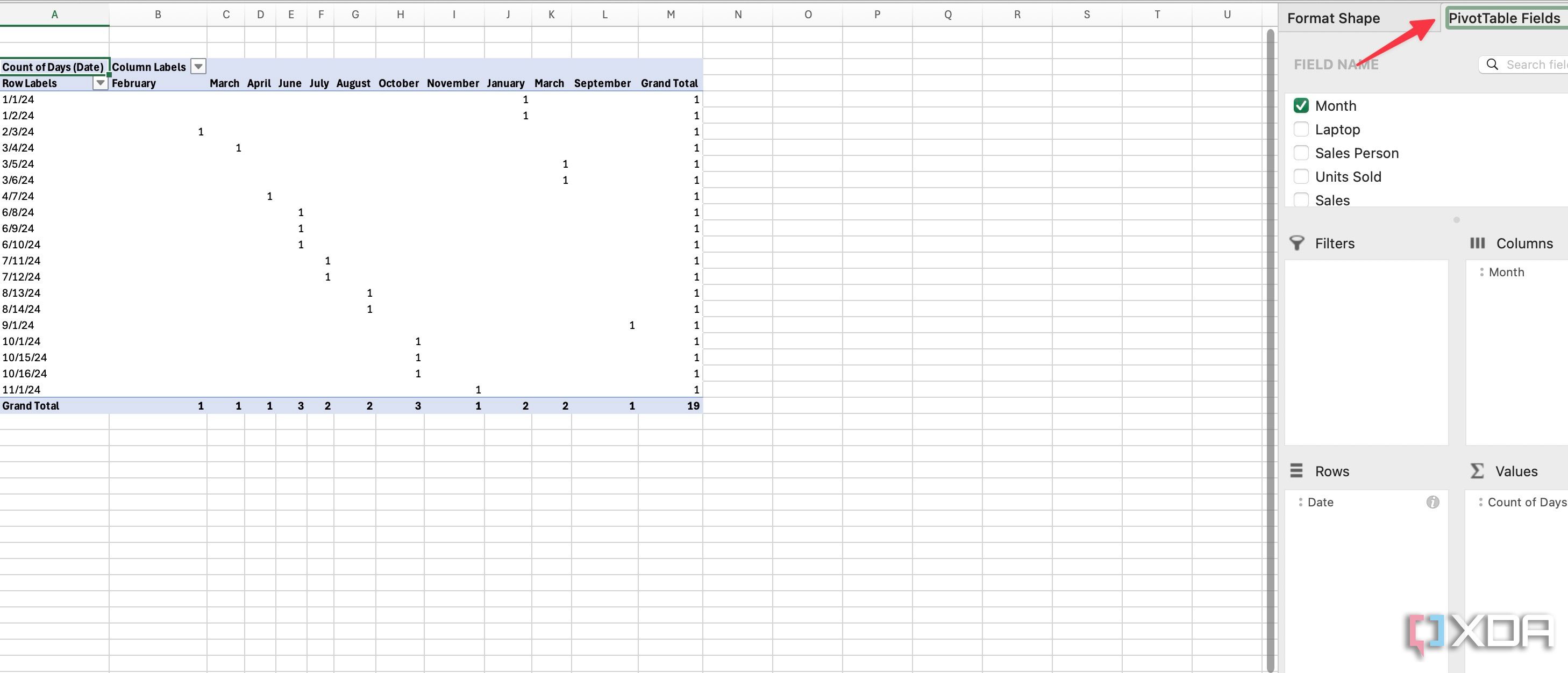
Select relevant fields from the sidebar and check your pivot table in action.
- Similarly, you can generate a pivot table for how many units each store has sold, which laptop each salesperson has sold, and more. The possibilities are endless for your database.
-
Once your PivotTable is ready for analysis, head to Insert > Charts and pick a chart type.
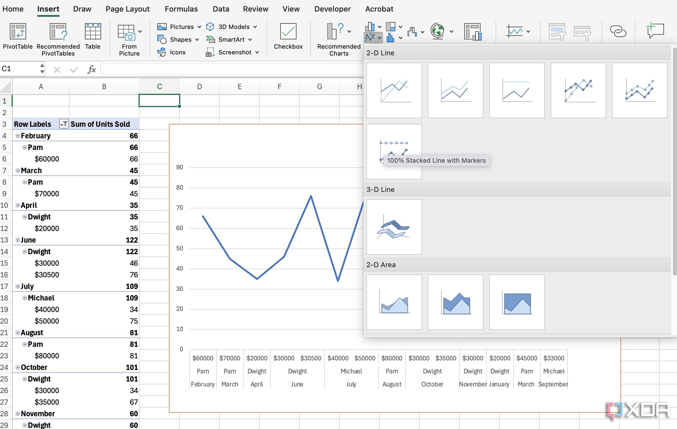


Excel offers ample options to customize charts. I highly recommend tweaking the chart to fit your preferences.
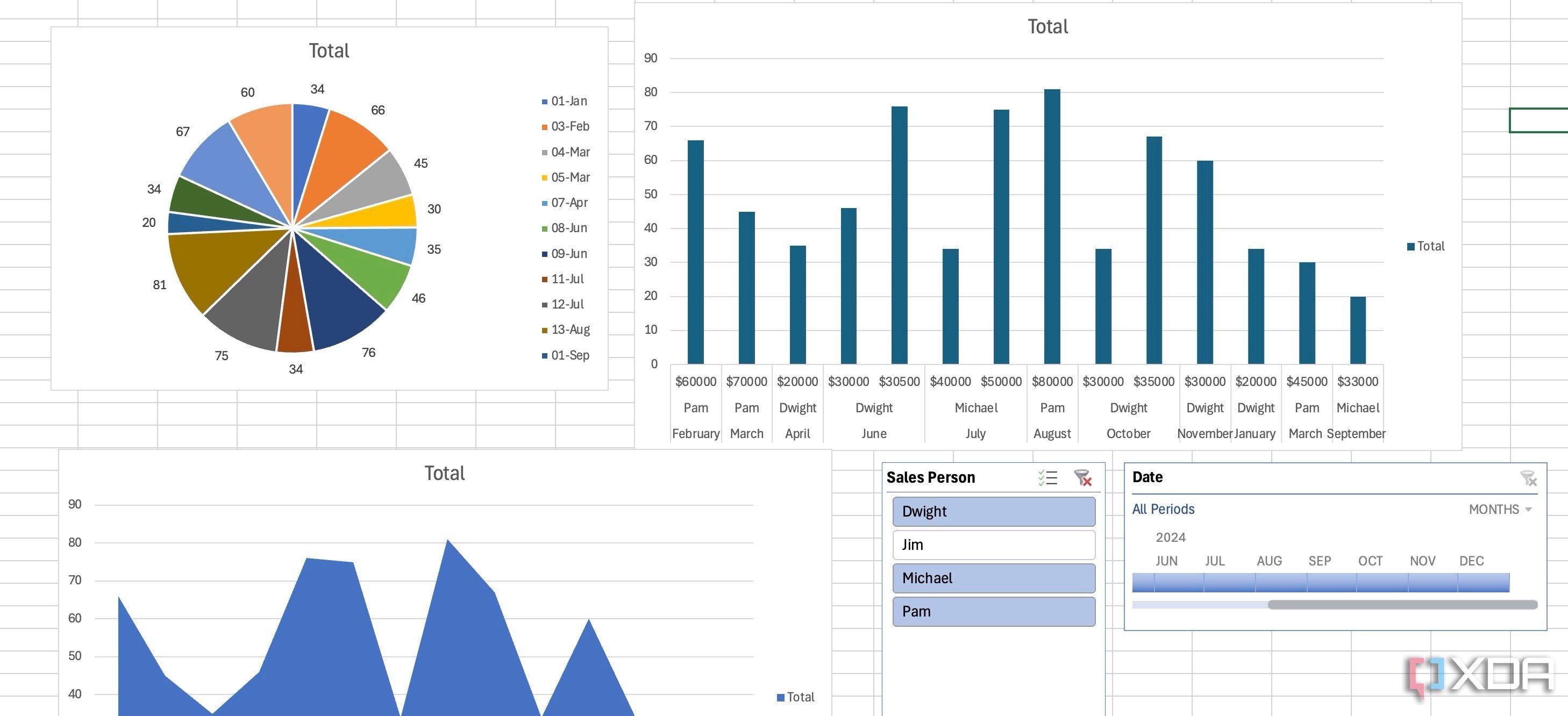
Design a dashboard
Once your PivotTables are ready, it’s time to place them on a dashboard. Create a new sheet, give it a unique name, and get started. You should choose appropriate chart types like bar, line, pie, and area for your data. You should also use a consistent color palette that is visually appealing and easy on the eyes.
There is also an option to insert shapes and icons to add visual interest. For example, use arrows to indicate trends or icons to represent different project stages.
- Create a new sheet, copy your existing Pivot charts and place them on a dashboard.
- I would also advise adding your company logo and branding elements to create a professional look.
-
Make sure to keep the dashboard clean and uncluttered.

Avoid using 3D charts as they can distort data.

Related
How and why I use Excel as my personal knowledge base
My journey to using Excel as a PKM tool
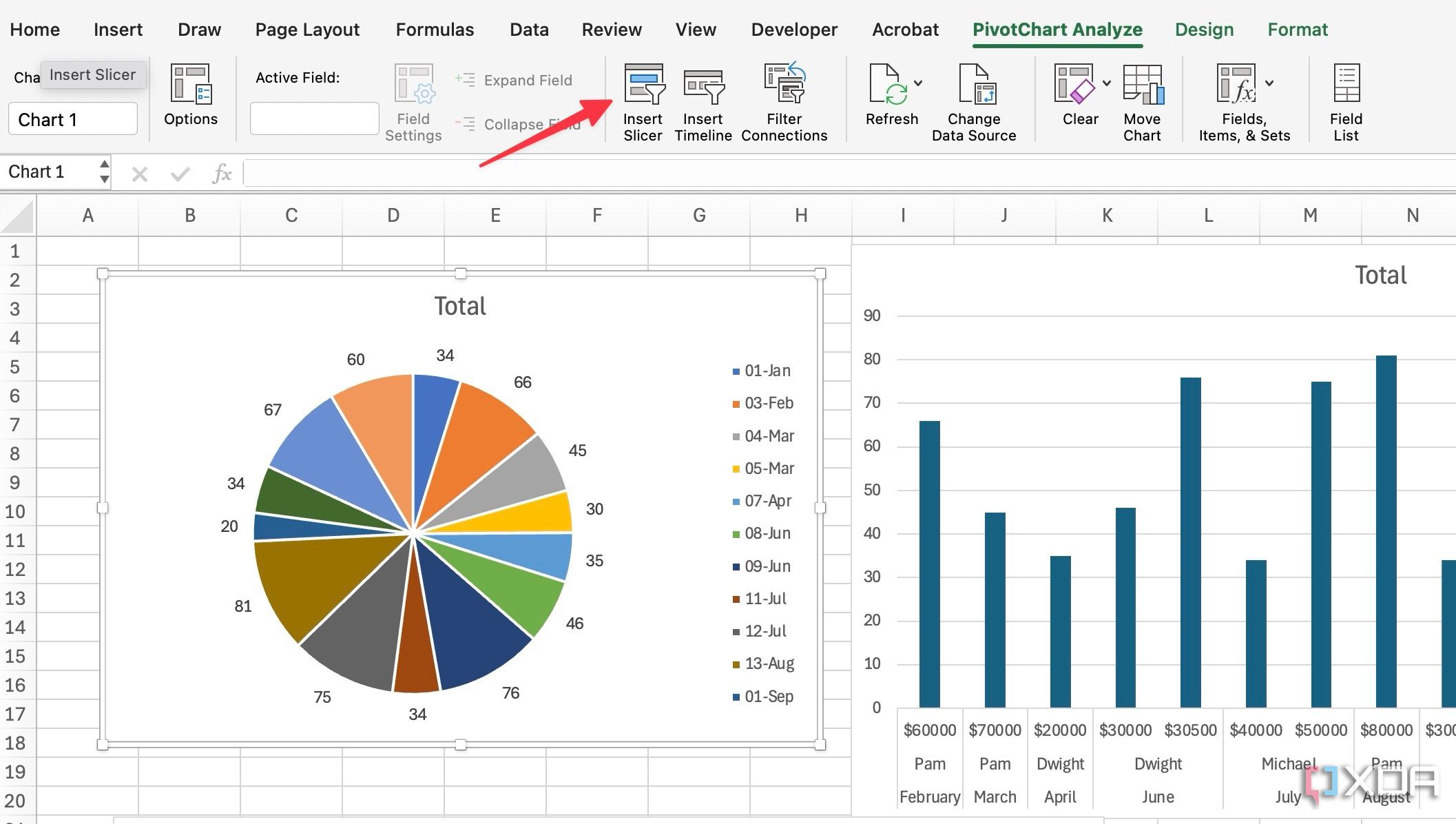
Insert Slicers
Slicers are a game-changer when it comes to creating interactive and user-friendly Excel dashboards. Slicers provide a visual and intuitive way for users to filter data in PivotTables and PivotCharts. They are much easier to use than dropdown menus or complex filter criteria. Here, I want to add a slicer for salesperson so that I can glance over their performances with a single click.
-
Open your dashboard and head to PivotChart Analyze. Select Insert Slicer.
-
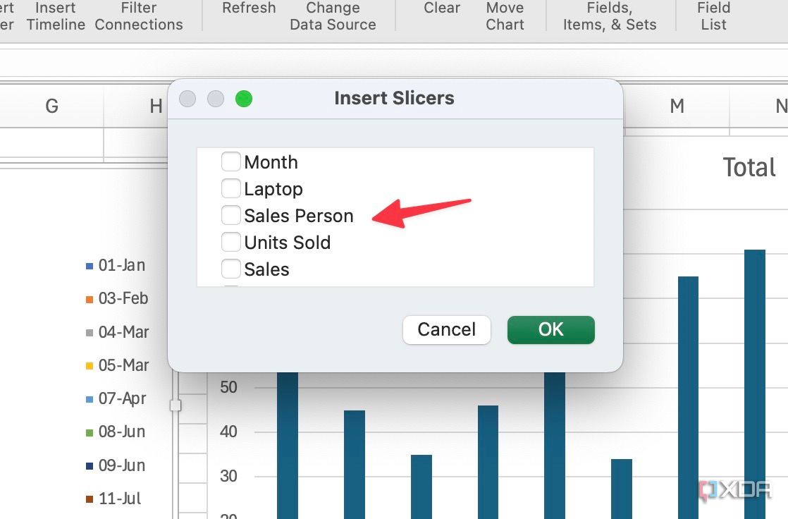
Click the checkmark beside Sales Person and click OK.
-
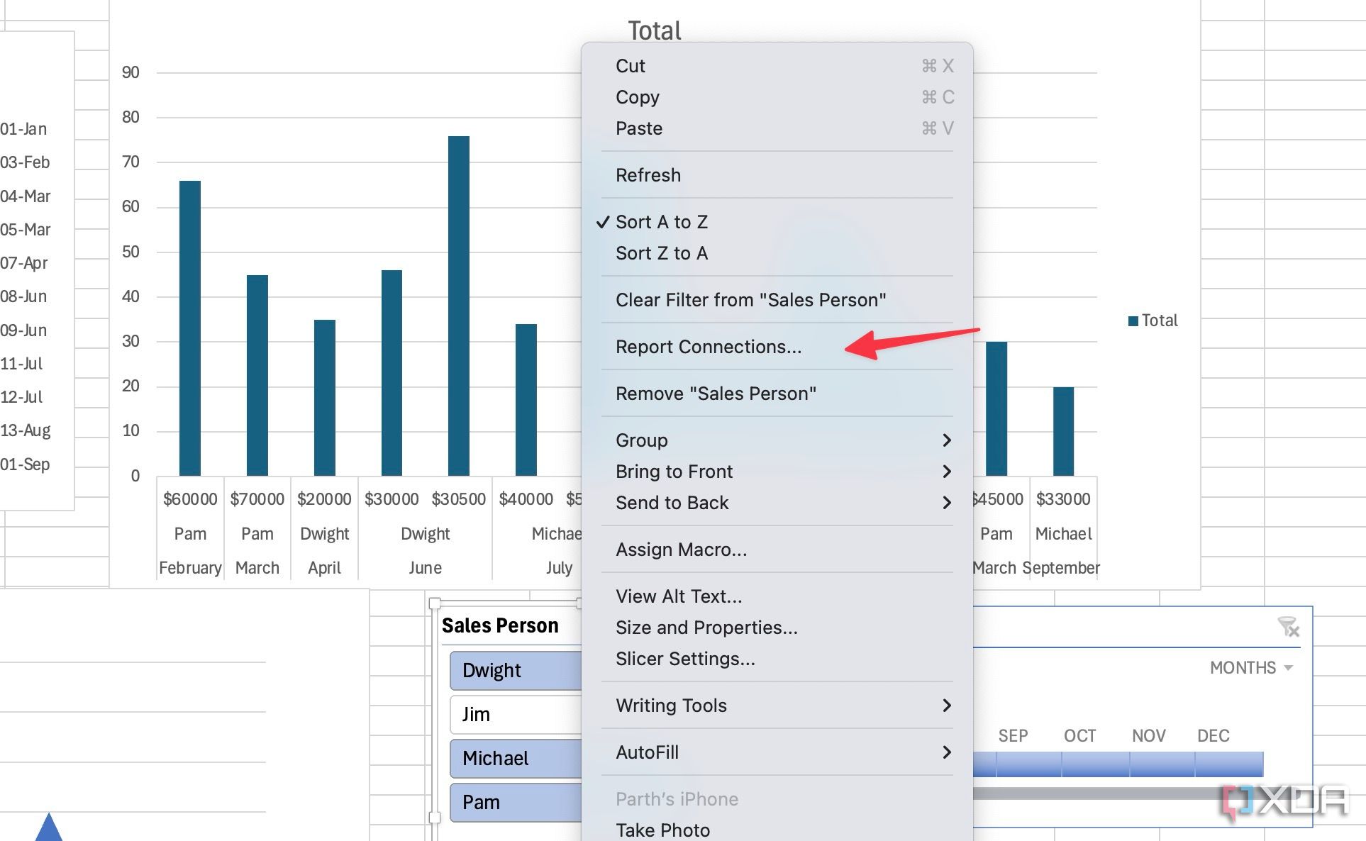
Right-click on it and select Report Connections.
-
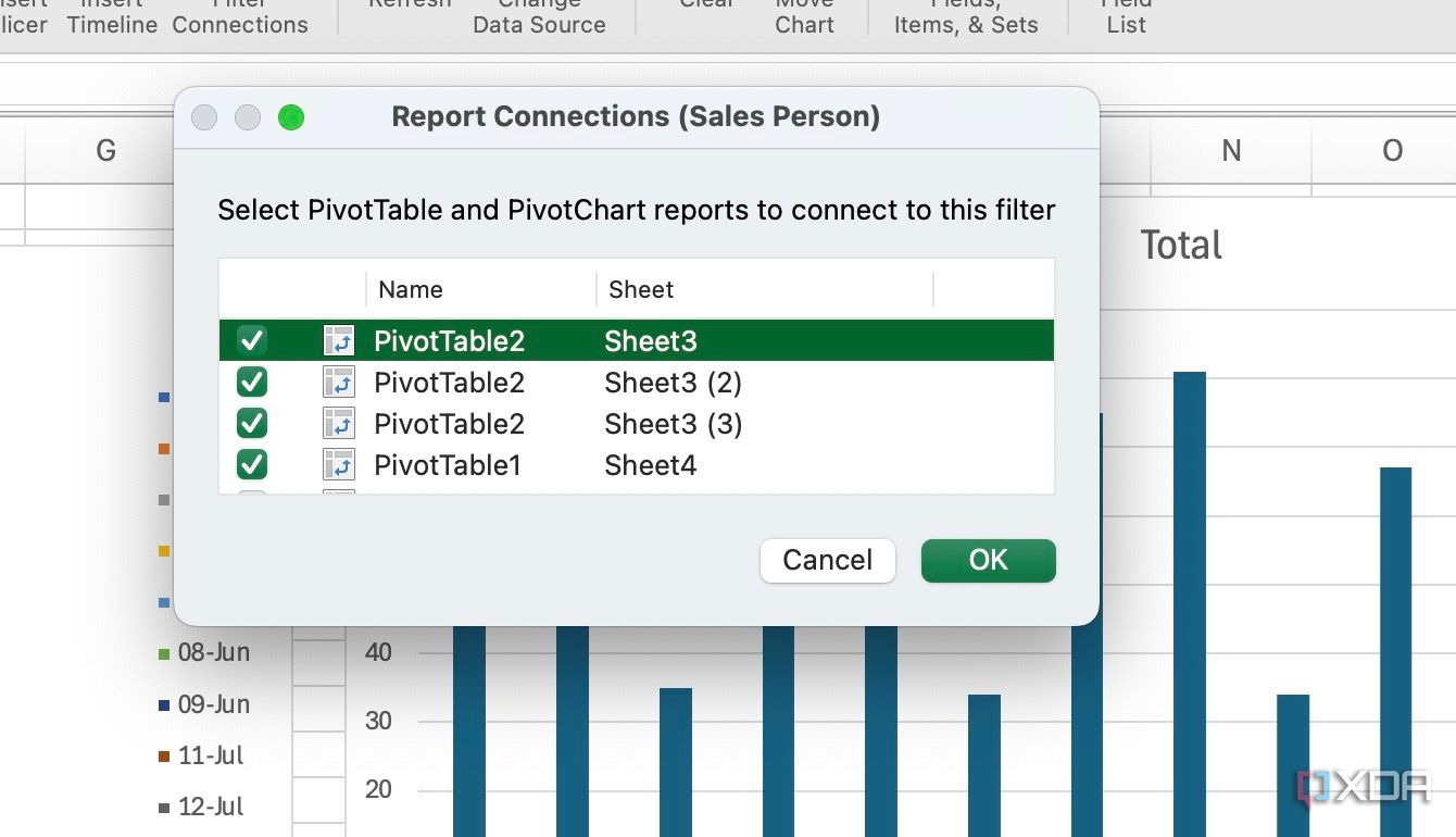
Select PivotTables from the following menu. Click Ok. Here, you are connecting the slicer to the pivot tables on the dashboard.


Now, I can click on Jim and check his performance throughout the year. Similarly, I can select Dwight on a slicer and check his sales data on Pivot charts. If you are dealing with dates or months, you can insert a timeline from the same PivotTable Analyzer menu.

Explore color formatting and themes
Once your Excel dashboard is ready, you can tweak it further with the built-in theming engine. You can head to the Page Layout and explore themes, colors, and fonts to give your dashboard a visual and consistent makeover. After all, too many colors can distract others from key points.

From spreadsheet to showpiece
Building a robust dashboard in Excel doesn’t require rocket science. Following these simple steps above, you can transform any database into a powerful visual tool. While this guide provides a solid foundation, remember that dashboard design is an iterative process. I recommend experimenting with different chart types, layouts, and data visualizations to find what works best for you.
What are you waiting for? Ditch the data chaos and embrace the clarity of a well-built Excel dashboard. Aside from a dashboard, here are other tricks to make your spreadsheets look stunning and professional.


